
Howdy, Stranger!
It looks like you're new here. If you want to get involved, click one of these buttons!
Categories
- 247.8K All Categories
- 22 >> Start Here <<
- 12 New Members
- 8 FAQs
- 88.8K Gear
- 40.4K Guitar
- 3.5K Acoustics
- 1.3K Bass
- 15K Amps
- 17.6K FX
- 352 Digital & Modelling
- 784 Other Instruments
- 8.5K Making & Modding
- 428 Gear Reviews
- 107 Guitar Reviews
- 74 Amp Reviews
- 119 FX Reviews
- 88 Other Reviews
- 756 Made in the UK
- 987 Theory
- 1.9K Technique
- 2.2K Live
- 3.2K Studio & Recording
- 2.2K Making Music
- 232 Events
- 15 Guitar Show 2018
- 865 Plug My Stuff
- 108K Classifieds
- 42.3K Guitars £
- 2.9K Acoustics £
- 145 LH Guitars £
- 925 Basses £
- 10.9K Parts £
- 18.8K Amps £
- 34.9K FX £
- 2.9K Studio & Rec £
- 6.3K Misc £
- 469 Personnel
- 56.1K Chat
- 37.4K Off Topic
- 1.2K Tributes
- 6.7K Music
In this Discussion
Become a Subscriber!
Subscribe to our Patreon, and get image uploads with no ads on the site!
1996 P Bass headstock decal help
 Danielsguitars
Frets: 3360
Danielsguitars
Frets: 3360
Hi has anyone got a 96 fender P Bass, I'm refinishing the headstock and Rothko and Frost said they had the correct decal so I stripped the headstock and they send me this big decal that's no good then they ask can I measure the decal, wish they said that to start with.
I just need the length of it and the size of the fender letters and precision bass ones.
Any help is appreciated.
Thanks.
I just need the length of it and the size of the fender letters and precision bass ones.
Any help is appreciated.
Thanks.
www.danielsguitars.co.uk
(formerly customkits)
(formerly customkits)
0 LOL 0
LOL 0 Wow! 0
 Wisdom
LOL 0 Wow! 0 Wisdom Base theme by DesignModo & ported to Powered by Vanilla by Chris Ireland, modified by the "theFB" team.
Comments
Good luck
Thanks anyway
(formerly customkits)
(formerly customkits)
Q2 - Which exact model?
For instance, a MIM Standard P Bass could have a fairly large solid black "CBS" script decal or a small "Eighties" one in silver with a black outline.
I cannot recall when the "spaghetti" logo was reintroduced on MIA Fender basses.
(formerly customkits)
You should be able to calculate the size of the decal by measuring the headstock and scaling it from the pic.
Or just send R&F the pic. Measure a repeatable dimension like from the top edge of the E tuner hole to the top edge of the G hole (ie along the line of the tuners) and they should be able to scale it very accurately.
"Take these three items, some WD-40, a vise grip, and a roll of duct tape. Any man worth his salt can fix almost any problem with this stuff alone." - Walt Kowalski
"Only two things are infinite - the universe, and human stupidity. And I'm not sure about the universe." - Albert Einstein
FWIIW, the nut width on that neck looks correct for a Jazz Bass.
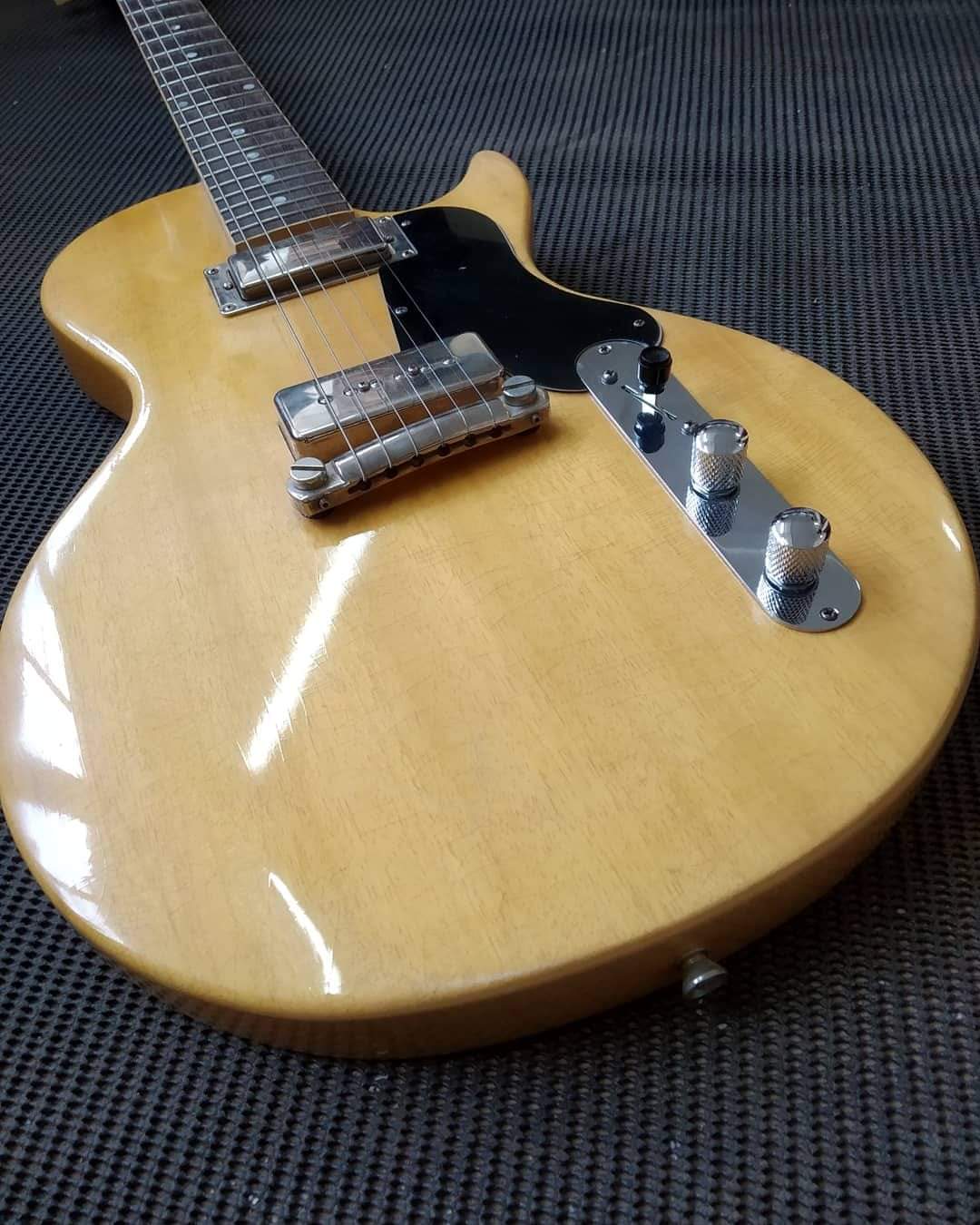
It's a 96 P Bass.
This is what I got sent, it's too big.
(formerly customkits)
I'd sling the image in CAD, scale it to get the tuner holes the right size, then measure the text. If you let me know the tuner hole diameter - maybe nut width too for comparison, it's probably a five to ten minute job.
It's basically the typeface Brush Script, but with a smaller -font capital E substituted for the standard small e.
PowerPoint will let you fill the letters in a fendery orange with a black outline of whatever weight. Fiddle until it looks right and then print it onto transfer paper with a decent laser printer.
I can't remember whether the little capital Es have to be rotated or whether they are already at the correct backward leaning angle.
Same story for the surrounding text. That uses a thinnish sans serif typeface. Arse around until you find a convincing one. I can't remember which I used, but it wasn't anything exotic. (But it definitely wasn't Ariel.)
Depending on which era you are aiming for, you might have to expand the letter spacing. That's in the Font pop up somewhere. Making curved text is in the Word Art functions.
Of course, this lets you do a logo that looks like fender from a distance, but actually says something else.
Any word or short phrase starting in F will be convincing from a distance. I wonder if, by any chance, any of you have suggestions?
I don't do cad or design really, I stick to making and finishing guitars.
Thanks for the suggestions everyone, I'll see what they come up with.
(formerly customkits)
That should give you a decent approximation.
(formerly customkits)
You could do a similar process with the nut width to cross-check as well, but probably not needed
(formerly customkits)